Responsive web design is a method of designing websites so that they automatically adjust and scale their content and elements to fit any screen size, whether it's a desktop, laptop, tablet, or mobile phone. This ensures that images and text are appropriately sized and that the user experience remains consistent and intuitive across all devices.
Introduction
Having a website that looks good and functions well on any device is crucial.
Responsive web design ensures your website automatically adjusts and scales its content and elements to fit any screen size, whether it's a desktop, laptop, tablet, or mobile phone.
This adaptability guarantees that images and text are appropriately sized, and the user experience remains consistent and intuitive across all devices.

Why is Responsive Web Design Important?
Many websites are not optimised for mobile devices, leading to poor user experience.
Issues such as images being too large for the screen, difficult navigation, and the need for constant zooming and scrolling can frustrate users, causing them to leave the site.
How Responsive Design Works
Responsive web design addresses these problems by using flexible grids and layouts, images, and CSS media queries.
This approach ensures that your website adapts to the user's device, providing a seamless experience.
For instance, a responsive design prevents images from exceeding screen width and simplifies navigation with elements like the burger menu, which hides complex menus under a simple icon, common in mobile design.

What is Responsive Web Design?
Responsive web design is a method of designing websites so that they automatically adjust and scale their content and elements to fit any screen size.
This ensures that images and text are appropriately sized and that the user experience remains consistent and intuitive across all devices.

How Webstudio Builds Responsively
At Webstudio, we specialise in building responsive websites that cater to various devices, including desktops, laptops, tablets (both landscape and portrait), and mobile phones (both landscape and portrait).
We achieve this by adjusting style sheets for each view, ensuring that your site looks and functions perfectly no matter the device.
We avoid hiding content from the mobile version and instead focus on making it easy for users to navigate.
For example, while tables can be challenging because they don't collapse well on smaller screens, we use techniques to make them more user-friendly.
Our designs incorporate the burger menu, a standard for hiding extensive menus on mobile devices, to enhance usability.

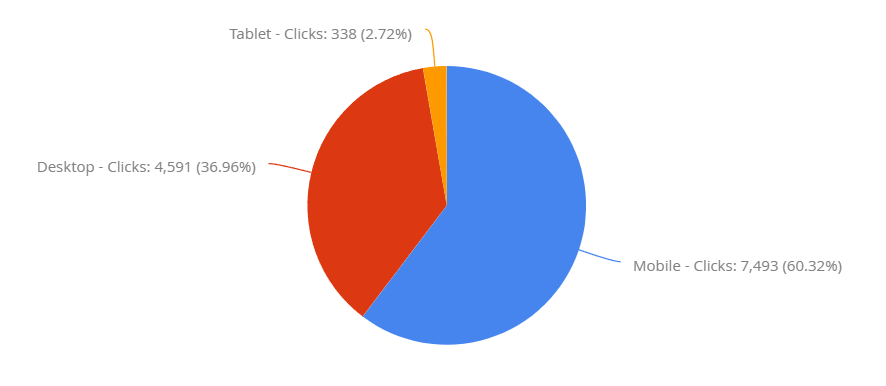
You can see that smartphones are the most used device. This is a B2C website and the graph shows organic clicks from Google.
Important Note: Google’s Mobile-First Index
Google's mobile-first index means that Google predominantly uses the mobile version of the content for indexing and ranking.
The majority of internet users access the web via mobile devices.
This shift underscores the importance of having a mobile-friendly website.
Google's shift to mobile-first indexing means that the search engine's algorithms primarily use the mobile version of a site’s content to rank pages from that site.
This change highlights the growing importance of responsive web design as a fundamental part of Digital marketing strategy.
Websites that are not optimised for mobile devices may suffer in search rankings, impacting their visibility and traffic.
Therefore, ensuring your site is responsive not only improves user experience but also boosts your SEO efforts by aligning with Google's indexing preferences.

Conclusion
At Webstudio, we are committed to creating responsive websites that not only look great but also perform optimally, providing a seamless and engaging user experience across all devices.
By focusing on responsive design, you ensure your website is accessible and user-friendly, which is crucial in today's mobile-first world.
Useful Resources

